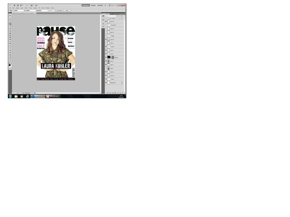
After reading all of my comments I am going to play around with my front cover and possibly add something to the background instead of using the plain white, I will also be looking at different features and try to make it look more conventional. I will also look at more things I can add to make it look as realistic as possible. Overall I am pleased with my feedback and will work harder to make my blog even better by adding as many posts relating to my magazine as possible.
Peer Feedback- Lucy Richmond
Your blog is very good and is up to date. You have done a lot of extra work and have done a lot of research all of which is relevant to the genre of music you have chosen.
Strengths: Your cover is good and follows the conventions of a magazine and is relevant to the genre of music you have chosen.Your mast head is big and bold and stands out on the cover and the image on the front looks professional.
Areas for development: add more features to the cover to fill in some gaps.
Peer Feedback by- Leah Darvell
Lots of good relevant research posted on your blog. Your blog is kept well up to date with lots of posts. To improve you could post some more extra things like videos to add to your blog.
Your front cover is bright and eye catching, following all the conventions. To improve you could add more text to your front cover to make it look fuller. Overall a good blog :)
Peer Feedback - Saskia Halman
Really detailed research into each area for the front cover. Easy to view and a good step by step guide from the research to the final result.
Front Cover - Shows music genre well and a good, easy to read layout. The colour scheme links together.
Possibly add a light background colour to add into the layout. Maybe a background for the main head line to make it stand out.
Peer Feedback: Lydia Jackson
Overall assessment: Lots of detailed research on the music magazines, the genre chosen and magazine conventions. A good variety of ways presenting research including moodboards and prezies and videos. A lot of planning for the front cover.
Strenghts: Consistant colour scheme, stuch to convenentions
Development: Put more on the front cover