Friday, 22 February 2013
Final contents page:
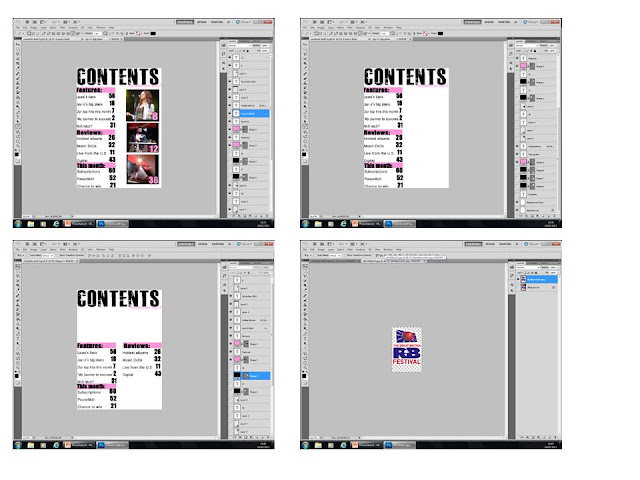
This is my final contents page that I produced after receiving my feedback from my teacher and peers. I decided to come up with something different as I felt unhappy with my other one. Overall I am pleased with how this one has worked as I think it follows conventions and I have tried to maintain/ re-in force the realism of it throughout my progress.
Thursday, 21 February 2013
Tuesday, 19 February 2013
Response from feedback:
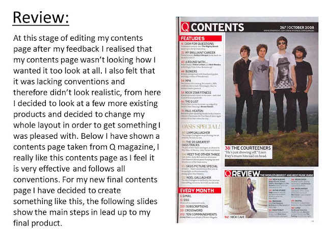
After looking at my peer feedback I have seen that I need to make some major changes to my layout to clear the space, I also need to take my images into consideration and look at changing them, and adding an image of my main cover story. I am also going to look at adding extra features to make it look more conventional and to maximise the realism of my magazine. I am going to play around with my whole contents layout until I get a layout that looks conventional.
Peer Feedback Lauren Bird
- Good colour scheme that fits the genre
- simple and well layed out
- Possibly add a few other things such as a letter from the editor to fill the blank space
Peer Feed Back - Liam Biglin
Strenghts - very conventional - good number of picture - good layout - includes page numbers (which stand out) - fits colour scheme
Improvements - use own pictures - maybe use a better font
Improvements - use own pictures - maybe use a better font
Peer Feedback
Kenneth Wilkinson
Strengths:
Strengths:
- Clear layout so the infomation is easy to read
- There is more than one image relating to the different articles
- Maybe add more features or competitions
Subscribe to:
Comments (Atom)


